Most often, web UI libraries fall under one of two categories. They may be part of a “framework”, or a grouping of UI components that share an appearance, a similar API, or are otherwise cohesive. Another category is usually the standalone library. Regardless of whether a standalone library depends on jQuery (I’m singling out this scenario because of its prevalence), they aren’t directly related to other UI components, which means they set their own terms with regard to API, appearance, and other conventions. Components that are part of a framework are usually hard to integrate with anything that’s not part of said framework, resulting in vendor lock-in. Components that aren’t part of a framework tend to be easier to integrate with other things, but most often they’re not designed to that effect. Composability is a much better alternative, and something we’ll explore in depth in this article.
Composable UI
Before I go any further,
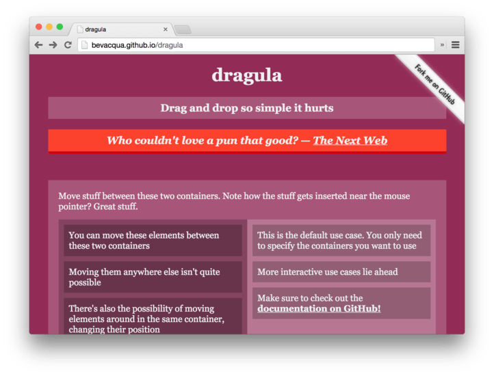
dragulanow has over 7500 stars on GitHub and was even featured on The Next Web! I’ll need a few moments to wrap my head around that! Wow.If you’ve never seen
dragula, check out the demo to get an idea of what it does.
Instead of having an autocomplete, a drop down list, a combo box, and a select box, it’s nice when you can do all of that with a single component. That’s reusability, you get to use the same component for many different use cases. Another form of reusability is composability, the ability to integrate a few different components into a cohesive user experience. It’s an often overlooked factor when developing UI components, but I think good UI components must be highly composable.
Composability can also go the opposite direction. Some programs are notoriously modular, and it gets quite a few bits and pieces (otherwise called “modules”) to get to something that “works”. One such example is woofmark. This library provides an editor on top of browser HTML <textarea> elements. I’m not using woofmark on ponyfoo quite yet, because I haven’t had the time to integrate it here, but I did implement some of the underlying modules. For instance, woofmark uses megamark under the hood to parse Markdown strings into HTML strings. Megamark is really an abstraction layer on top of markdown-it, which adds a couple of minor niceties such as syntax highlighting in code blocks, and the ability to use <mark> DOM elements to highlight a “fancy” piece of text. Woofmark also uses domador to convert DOM trees or HTML strings back to Markdown, and that has a extensibility structure in place allowing one to extend their understanding of how HTML should be converted into Markdown. If you had custom Markdown -> HTML directives, it’s only logical that you implement the reverse for a HTML -> Markdown conversion. With all this converting going on, it’s probably insane to try and sanitize the inputs and outputs on your own, so a specialized library takes care of sanitization at the HTML level.
I’ve already mentioned a few modules, each in charge of a different portion of the rich-editing experience in woofmark. Here’s a list of the modules I’ve mentioned, plus a few others even deeper in the dependency chain.
markdown-itis one of the lowest-level modules used in this use case, and it parses CommonMark-compliant markdown into HTML stringsmegamarkis a wrapper aroundmarkdown-itwhich ties it withhighlight.js, a syntax highlighting module andinsane, the HTML sanitizerdomadorparses HTML or DOM nodes back into Markdown, and can be extended to match the extensions provided tomegamark, so that the output stays consistent both wayswoofmarkties everything together and provides a nice<textarea>upgrade that allows entering Markdown, HTML, and WYSIWYG input in exchange for plain Markdown- Plenty of other low-level modules are at work, such as
crossventfor dealing with DOM events in a cross-browser manner;he, which deals with unicode; andjsdom, which deals with creating awindowcontext on the server-side; and many others
As you can probably imagine, trying and cramming all of this functionality into a single module would be a dreadful endeavour, not to mention a waste of productivity, time, and hence, ultimately, money. In contrast, keeping the functionality in separate modules enables us to reuse them across our stack, across our projects, and out on the open-source world, where people find it way easier to contribute patches if the code is small, self-contained, and does one thing well.

The example shown above is woofmark, and it underscores just how useful composability can be. I’ve developed woofmark for Stompflow.com, as to build upon the Markdown editor that’s available here on Pony Foo. Woofmark provides the added benefit of being able to interpret HTML and WYSIWYG as well, which shouldn’t be understated. Meanwhile, however, I’m able to use the Markdown parser on Pony Foo, even though it was originally built for Woofmark and Stompflow. Thanks to loose coupling, and since it wasn’t built into the editor, I can get away with using it elsewhere.
If this was a monolithic framework for Markdown, HTML, and WYSIWYG editing, I would have, in contrast, a terribly large code base, much larger than that of woofmark (which I already consider monolithic!), with a few added drawbacks.
- I wouldn’t be able to use
insaneas a general-purpose lightweight HTML sanitizer - I wouldn’t be able to use
megamarkon the server-side to produce the same HTML output that the client-side displays - I would have to implement something like
crossventeverywhere I want to deal with DOM events, unless I’m willing to drop jQuery into everything I develop - I wouldn’t even know where to start poking at
jsdom, which is immensely huge in terms of a web browser, but only used server-side - I wouldn’t be able to use any of these modules across multiple code-bases, unless I did lots of copy-pasting and ignored the benefits of having bugs fixed on a global scale
Sharing code across multiple projects, or even just Node.js and the browser, is too big of a productivity boost to oversight. Yet, the most of us are still not buying into modular development because “the asking price” is too high to get in the front door, but in reality we’re missing out on being that much more productive in the long term.
Tag and Drop
Consider the example below, where we use dragula, a drag and drop library; and insignia, a tag editing input enhancement, to provide a highly usable tag editing experience. Contrary to woofmark and many of the modules that surround it, neither of these libraries where designed with each other in mind. Composability was, however, considered when designing both of them. In the case of insignia, this simply meant allowing the consumer to start off with an <input/> element that may contain space-separated tags. Once JavaScript kicks in, insignia converts those tags into pretty DOM elements that can be styled and whatnot. This allows the insignia-consuming application to function even when insignia fails to load: a minimal <input/> element with some tags in it will still be available.
In the simplest of cases, insignia converts the value to tags and takes over user input by binding a flurry of keyboard event listeners on input. Note how simplistic the API is at this level.
insignia(input);
Of course, you can always rack up complexity, with both dragula and insignia, setting many different options and customizing what can be done with them. Keeping down the complexity and progressively increasing the difficulty with which a consumer can customize your component may prove hard, but it’s also the best way to deliver an experience that can be digested over time. They start out using your simplest use case, and then they may discover more advanced use cases as they go over your documentation or keep using the component. This way you keep the barrier of entry low while the usability (and applicability) of your module stays high. Notable examples of this sort of architecture include uglify-js, tape, browserify, and dragula (if I may say so myself), among others.
Dragula is an entirely different animal than insignia. It’s goal is to feed on the blood of others provide a thin interface between humans and the underworld of drag and drop. It doesn’t make lots of assumptions about what your use case is, so it can remain flexible. The primary assumption dragula makes is that you probably want to be able to drag things between one or more containers. These containers, dragula asserts, will have any quantity of top-level children waiting to be dragged away and dropped somewhere else. Or in the same container, providing the ability to re-order elements within a container. This effectively covers most use cases, there’s many other things you could do with dragula, but for the main use case, it feels too good to be true:
dragula([container1, container2, container3]);
Now you’re able to drag any top-level children of container1, container2, and container3, and drop them back onto any of those containers.
Insignia has a constraint, it demands that the consumer places their <input/> as the single child of another DOM element. That <input/> then gets <span> siblings on both sides, where the tags are placed. The reason for this constraint is that it translates into a benefit that, on its own, justifies choosing insignia over any other tag editing library out there: the ability to seamlessly move between tags simply by using the arrow keys, without flickering or stuttering.
When the user wants to navigate to any given tag, every tag between the <input/> and that tag is moved out of the way. Consider the following example, where the user clicked on the highlighted [tag].
[tag] [tag] [tag] <input/> [tag] [tag]
In this case, every tag to the right of [tag] that’s not already on the right of the input is moved to the right. Then the highlighted [tag] gets removed, and the input assumes it’s value. This sounds highly invasive, but in reality it’s exactly the opposite. Focus never leaves the <input/>, and thus is never lost, which is really important when trying to improve the rudimentary (yet reasonable, and often underestimated) UX of entering tags by typing some text into an <input/> field.
Besides meaning that the UX provided by insignia is actually worthwhile,* , the way in which it operates is quite unobtrusive with regards to the DOM, as it doesn’t do much more than move (or add) elements between the two siblings to the <input/>. Before going to a demo and showing you how these two libraries work together, look at this piece of code which is all the JavaScript used to tie both pieces of the puzzle together.
var input = document.querySelector('.input');
var result = document.querySelector('.result');
var tags = insignia(input);
var drake = dragula({
  delay: true,
  direction: 'horizontal',
  containers: Array.prototype.slice.call(document.querySelectorAll('.nsg-tags'))
});

input.addEventListener('insignia-evaluated', changed);
drake.on('shadow', changed);
drake.on('dragend', changed);

function changed () {
  result.innerText = result.textContent = tags.value();
}
The highlighted options in dragula are needed because:
delayallows click events to get through before being considered drag eventsdirectionisn’t required, but it makes it smoother fordragulato figure out where tags should be droppedcontainersis just both of the tag containers created byinsignia, casted to a true array
Whenever a new tag is evaluated by insignia, or a drag event ends in dragula, the result gets refreshed. Refreshing the result whenever dragula's shadow moves isn’t all that necessary, but it does provide an interesting boost to perceived performance!
See the Pen Composable UI: Insignia and Dragula by Nicolas Bevacqua (@bevacqua) on CodePen.
Tag Completely
Remember how I bragged about how unobtrusive insignia is? It’s not just useful for doing things with the elements around it, but you can also get away with relying on the <input/> itself not doing anything funky too.
In this example, we’ll mix insignia with horsey, a general-purpose autocomplete library that also doubles as a drop-down list (and why not, a “combo-box” too, whatever that may be). Horsey can be used to add autocompletion features to an <input/>, a <textarea>, or even to non-input elements like a <div>, effectively becoming a drop-down list. Autocompletion is added via a list that can be controlled using the keyboard, just like insignia, or by clicking on the suggestions.
Rendering the list of suggestions has a default implementation that just takes a string, but you can also use any templating engine you want to render the list items. In the screenshot below, the “fruits” were rendered by adding an image tag along with the text.

The code barely even changes, we’re still creating a tag editor with insignia(input), but we’re now using horsey to add an autocompletion feature. Of course, there were some styling changes, but those aren’t as interesting.
var input = document.querySelector('.input');
var result = document.querySelector('.result');
var tags = insignia(input);

horsey(input, {
  suggestions: [
    'here', 'are', 'some', 'tags',
    'and', 'extra', 'suggestions',
    'ponyfoo', 'dragula', 'love',
    'oss'
  ]
});

input.addEventListener('insignia-evaluated', changed);
input.addEventListener('horsey-selected', changed);

function changed () {
  result.innerText = result.textContent = tags.value();
}
Here you get suggestions on what tags to enter next, and you can also amend a previously entered tag just by opening the autocomplete list and picking a different tag, pretty neat! Again, all of this is possible because horsey doesn’t take any radical actions on the <input/>, it just helps you pick a value and places it’s suggestions below the input, but that’s it! There’s no further DOM alteration coming from horsey, which is just what insignia needs.
See the Pen Composable UI: Insignia and Horsey by Nicolas Bevacqua (@bevacqua) on CodePen.
A Horse that Barks
Horsey even works in <textarea/> elements, following the caret (text cursor) around and whatnot. This makes it the ideal companion to woofmark, if you have entities you want to hint at: issue references, like #40; at-mentions, like @bevacqua; or anything else.
While woofmark is based on legacy code and hence quite abysmal to look at, it does a good job of keeping large chunks of code in other modules. It’s up to you to provide a Markdown to HTML parser, as well as an HTML to Markdown parser. Of course, you get recommendations. You should probably use megamark as your Markdown parser, and domador as the DOM parser.
The code below is what’s used in the demo to tie woofmark and horsey together. In the first highlighted block you’ll notice that we’re using tthe pure “distro” versions of both megamark and domador, although in practice you’ll probably want to wrap them in your own methods and customize their behavior. Since we’re using the distros, we’ll just turn off fencing, the ability to parse triple ``` backticks back and forth. Otherwise, we would have to add some more code to detect the programming language when parsing HTML back into Markdown. Not something we want to do for a simple demo.
var textarea = document.querySelector('.textarea');
var editor = woofmark(textarea, {
  parseMarkdown: megamark,
  parseHTML: domador,
  fencing: false
});

horsey(textarea, {
  suggestions: [
    '@bevacqua', '@ponyfoo',
    '@buildfirst', '@stompflow',
    '@dragula', '@woofmark', '@horsey'
  ],
  anchor: '@',
  editor: editor,
  getSelection: woofmark.getSelection
});
We had already played a bit around with horsey, so what are all the new highlighted options? While everything we’ve seen so far is composed, I’ve cheated a little for woofmark, and so horsey helps you out if you want to use it with woofmark. The reason for this is that I usually have them working side-by-side in my projects. In hindsight, horsey shouldn’t take a Woofmark editor instance, because that’s very tightly coupled. Instead, an intermediary module should bridge the gap. It’d still be reusable, but horsey itself wouldn’t need to know about woofmark anymore.
Woofmark has the ability to switch between user input on a <textarea> for Markdown and HTML, or a <div contentEditable> for WYSIWYG editing. In this sort of long-form user input, it makes the most sense to append the suggestion, provided by horsey, onto what you already have on the input. The default behavior for horsey, which makes the most sense on inputs, is to replace the value altogether. The anchor property is used to determine when the suggestions should pop up. In this case, as soon as we see a @ character. When a suggestion is chosen, anything before the suggestion that matches it will be “eaten”. Suppose I’ve typed @beva and pressed Enter on the suggestion to enter @bevacqua, Horsey will figure out that @beva was the value to autocomplete, and it’ll just add cqua to that.
The reason why I’ve inserted knowledge about woofmark in horsey, originally, was that I still needed some of the same logic to deal with <textarea> elements on horsey anyways. In hindsight, again, I should’ve just come up with a higher level abstraction that could be reused via a third module. Similarly, there’s nothing stopping woofmark.getSelection from being its own standalone module, as that’s just a polyfill.
There’s always room for improvement!
I’ll go get my modularity affairs in order. In the meanwhile, check out the Woofmark + Horsey demo on CodePen!
See the Pen Composable UI: Woofmark and Horsey by Nicolas Bevacqua (@bevacqua) on CodePen.
P.S How obnoxious do you think the highlights are? I probably went overboard with those, but I just wanted to implement that for such a long time, that I figured I’d put them to good use! Haha.
* I was unpleasantly suprised to discover that many tag editing libraries offer a markedly worse user experience than what plain <input/> fields already do.
